Thursday, 30 September 2010

Spellbinders Shapes Spectacular!!

Hello to you all on this strangely cold Spring day here in Perth!!

I've heard that Fall has really 'fallen' (pardon the pun!) in the U.S and everyone is starting to feel the change in temperature, pull blankets out of closets and bring their jackets with them when they go outside. LOVELY!!
 
Today I'm SOOOOO Super-excited (Yes, Super with a capital S) to be sharing some of the new Spellbinders Shapes dies that we have in store--goodness me they're enough to make my head spin with possibilities!!  Please be sure to sit down when you read this...and let someone else in the house know what you're doing--preferably to listen out for a *thud* when you fall over from how pretty these are *heehee*

Spellbinders Beaded Circles

Gah!!  That's all I can say...GAH! So pretty. SO many options!!! (I should point out that I stopped typing to clap a little bit in excitement! *wink*)

Spellbinders Lacey Squares Nestabilities
Spellbinders Classic Diamonds
HELLO?!?!?! Are you still sitting upright?! How gorgeous are these! They're sooo simple but so elegant!  I'm really excited to play with these two, I think they might be my favorites...

Spellbinders Labels 14 Nestabilities
What's another word for "Gah"?!?! How about *sigh*.  Yup...*Sigh* works :)  I love love LOOOVE this one! It looks like pink clouds to me--and that's a double bonus, because I love clouds and I'm most definitely a pink girl.  I think I want to do this one with elephants on a card...I'm not sure why elephants?? But cute elephants and pink clouds is what immediately pops into my mind when I look at these--is that weird?! lol
These as labels, or even as pages in a pretty mini-album?! Yes please!!

Spellbinders Beaded Circles

Doilies, frames for photos, unusual journalling tags--the possibilities are endless with this one...and how about;

Spellbinders Crowned Circles

These make me think of suns for layouts about summertime, or frames for photos--imagine putting a gem or some bling in each little edging point?  These are even great for a masculine project. 

Spellbinders Labels 17

Confession time: I have an UNHEALTHY addiction to labels.  I can't get enough of them.  I want to use them on layouts (cut in half and put on either side of photos or as journalling tags), on cards for a frame around a nice Copic-colored image...nice nice nice nice. What do you use them for? *smiles*

Spellbinders Beaded Ovals Nestabilities

Mirror Mirror on the wall...these are gorgeous aren't they?! (You are nodding aren't you?!) Just perfect for so many things.  A photo, on a card front, an unusually shaped journalling tag, softly inked as a background...many many options.

Then there are these funky little numbers;
Spellbinders Wonky Squares
I don't even know what to say besides FUN.

Are you still with me?! Don't worry, that's all for today.  The bruising from falling off your chair with all of these will hopefully subside quickly *heehee*
Well folks, that's all for today--thanks so much for stopping by and I'll be back again in a day or two with some fun Copic coloring!!

Take care till then--

Linda x

Tired


Hi lovelies--

no card or anything today, because...

LOL

how cute is that cat?!

I just got back from a HUGE morning with the girls. Why does going shopping for TWO things at TWO different shops always seem like you've dragged you and 58 other people around the ENTIRE perimeter of Australia?! I'm sure we didn't really do that much!! My poor mum is on school holidays and offered to come with us--I don't think she'll do that again! lol Thanks for your help mum xx

Yesterday?! That was worse... *yawn*

PLUS I've offered to do 'We have moved" cards for my best friend--WHAT'S WRONG WITH ME?!?!!? I must be masochistic I tell you...

I'm enjoying the creative process but gah-I never make simple cards do I?!

Anyway, I gotta write a blog entry for a2z...got some SUPER gorgeous Spellbinders in!!! *claps with glee*

Next post I'll have a photo of my FIRST Wedding card and my first Engagement card--I'm pretty happy with both!

Talk to you soon dears!

Monday, 27 September 2010

Love for Nichol Magouirk and a layout!

Hello again!

I've tried and tried and TRIED to get to the computer this week but life just got in the way, you know?! Actually I hate that saying, that 'life gets in the way'...it's LIFE!!! It can't possibly be in the way because without it, there'd be no 'way' to get in the way of!! (this is getting confusing...)
How about...hmmm... I just never quite got here. That's better isn't it?!

Ok anyhow, just a quickie, I've got a layout for you tonight. I know!! An actual LAYOUT!!

I don't think I've discussed here, the level to which I am currently O-B-S-E-S-S-E-D with Nichol Magouirk. I mean, if I could, I would LITERALLY sit in a tree outside her studio window just to watch her work--and I don't mean that in the scary stalker way, I mean that in the I-would-take-notes-of-every-single-thing-she-did kind of way. I already do that with her blog and videos, so this would just be the next step :)

It's a love-affair more than it is an obsession, but the love affairs of the old black and white movies-the ones you know are going to last forever; not the modern day romances that just seem to be too flippant. I'm talking L-O-V-E. I just sigh every time I see something else she's made...and then I rapidly click on my bookmarked link to the a2z store and I start ordering EVERYTHING I've just seen her use lol!

Anyhow, this is the layout she did that inspired me;you can find the post on it HERE-- but before you look at her blog, just send me a note to say goodbye, coz once you've seen her work, you aint comin' back here! lol .

See what I mean?! It's just ...gorgeous. There was another layout she made that I had in the back of my mind when I was putting this together too, but I can't find it on her blog. She updates nearly every day so there is a LOT of gorgeousness to scroll through.

So here is the layout I did:
A few points of 'interest' on what I did:
  • The Hero Arts banner stamp is inked with Peeled Paint, Mustard Seed, Fired Brick, Wild honey and Tumbled Glass Distress inks (I saw Nichol do this in a post and it just looked too amazing not to try).
  • I don't have any cute cloud paper, so I made my own with Hero Arts Soft Pool Shadow Ink and Hero Arts Clouds Background stamp.
  • I used a uniball white gel pen to make a dashed line/'faux-stitching line' around the outside of the blue cardstock.
  • I set 2 small eyelets on either side of the central strip of cardstock to thread the twine through, I love this effect. The button which is attached to the little heart that sits on the thread has a knot of the same twine, but was attached seperately (TOO hard to do it all as one piece!!).
  • The journalling reads:
    I love this little face so much> I call it "the are you still there mum?" face. Even when you're sitting on my lap, you still look around to check if I'm still there. I love that you like me near, that you still need me. Your curiosity about the world and everything aroudn you is increasing, but you still like to know that mummy is nearby.
Here are a couple of close-ups so you can see what I've done.
this is a shot of the journalling which I printed out onto vellum paper so you can still see the patterned paper behind it. The foam hearts are from American Crafts. I have no idea if they're still even available. The title lettering is cut out using my Cricut and the A.C Fabric thickers called "Patchwork" *LOVE THESE!*


It's hard to see here but I've created two tabs using yellow cardstock and some leftover paper from the cloud background I stamped (Hero Arts Soft Pool Shadow Ink and Cloud Background Stamp)

I like how the AC foam hearts give so much dimension and interest without actually adding much bulk.


Well that's it!! I'm sorry I didn't link over to the a2z store like I normally do for my products but I'm super-tired tonight.

I'll talk to you all soon! Hope you liked :)

thanks so much for popping over :)

Friday, 24 September 2010

Fighting against the 'matchy-match'

Happy Friday to you all!!

Did you all enjoy Virginia's GORGEOUS Halloween cards?! I know I did.  In fact, after I finished giggling at that kooky little owl on his tree branch, I decided to have another look over at Virginia's blog.  Once again I was left feeling inspired and more than a little envious!

I have a confession (of sorts) to make.  I'm a matchy-matchy type of girl.  I like colors to either be in the same tone or shade, or be completely identical.  My shoes almost always match my handbag (which yes, equates to a lot of both--not that I've used either since becoming a mummy!) and if they don't match my handbag, they match my top/shirt.  I can't stand it when it doesnt' match--more specifically, it doesn't occur to me NOT to match things.

It's the same on my cards and projects.  If I can't find the EXACT right shade of cardstock for a background or matte, then I'll change the image or add another color in so I can match that one.  Yes, I'm a matchy-match girl.  I've said it.  Now you all know my big secret.

shhh. don't tell anyone!
So tonight, I set myself a challenge.  To FIGHT the matchy-match tendencies within me.  And I think I won. Sort of.

Here is my card:
terrible photo--but it's the best I could do :) *sorry!*


See the ribbon?! It's BLUE!!!!!  There is no other blue in the card, but the ribbon.  I'm quite proud of myself :) You wanna know the best part? I kinda like it!!  It only took me 20 minutes to choose the ribbon too! (Which is why the card took me about 30 minutes to make lol!) So now, although exhausted at the effort I expended going through EVERY spool of ribbon in my stash, I'm proud I broke the pattern.

ex-hau-sted.

Hope you liked :)

Here's what I used:

Spellbinders Nestabilities Deckled Edge Classic Ovals LG
Ranger Tim Holtz Distress Ink Pad Walnut Stain
Ranger Tim Holtz Distress Ink Pad Milled Lavender
Ranger Tim Holtz Distress Ink Pad Victorian Velvet
Ranger Tim Holtz Distress Ink Pad Spun Sugar
Hero Arts Time to Stamp Cling
Hero Arts Old Letter Writing Woodblock Stamp
Hero Arts Tall Flower Stamp
Ranger Diamond Stickles

Tsukineko Versamark Watermark Ink

Memento Tuxedo black ink

extras from my stash: Purple Button, Blue ribbon, Twine.

Has my attempt at breaking the habit worked out for the better? Or should I stick to matchy-matchy?!  As always, I love to hear what you think!


Till next time,

Linda

Wednesday, 22 September 2010

Guest Blogger Virginia Lu and a Challenge!

Hi there friends!! Happy Wednesday!!!

Today I'm SO excited, because we have a special friend of ours visiting, Virginia! 
this was me when Virginia agreed to be a guest blogger :)
Virginia's blog HERE is just fantastic and her creations are even more so.  She's not only funny as all get-out and sweet, thoughtful and just all-around lovely, she's SUPER-creative!!
I check in on Virginia's blog daily (even though I'm signed up for the alerts when a new post comes up, I can never wait!) and I'm consistantly amazed and impressed with not only how versatile Virginia's style is, but what comes out of her inspiration!  
I'm a very "literal translation" kind of girl (maybe it comes from learning languages?!) so when I see an inspiration photo, my 'translation' into a card is usually quite similar to the original. 

Here's an example: I recently participated in the etsy inspired challenge, this was my inspiration photo:

which is from the amazing Becky Kazana's etsy shop (HERE).
and here's what I made:
See what I mean?! LITERAL.  I saw flowers, I made flowers, I saw yellow, I made yellow.  lol!  (You can see the full details of this card HERE)  
But Virginia?! Nuh-uh. She's AMAZINGLY creative and participates in challenges constantly, which has made her a truly innovative cardmaker. 

SO, when she agreed to be a special guest on the a2z blog, we were so excited!!  Virginia's cards are rarely super-extravagant, they're almost never highly embellished.  They're clean and simple, they're sweet and fun and kooky (just like Virginia I think!!).  Hopefully seeing some of her creations will inspire those of you who lack experience (or are just a bit low on mojo).  I know I've used her creations as inspiration MANY times.
Therefore, without further ado, I give you Virginia's first specially designed for our blog Halloween Card "Boo!";


See what I mean?! Simple, effective, funny, kooky--FABULOUS!!

Here are some step-by-step instructions straight from Virginia:

1. Stamp house in Versamark and emboss in white on black card stock
2. Cut the house and set it aside
3: Distress the pumpkin color card stock with Antique Linen
4: Run the bottom throught Cuttlbug with Bubbles folder
5: Use hard surfaced sponge and lightly colored the pop-up bubbles
6. Stamp the ghost images in black and cut them out.
7. Plaace all pieces and plan out for space to sentiment
8: Stamp BOO with the Alphabet set and trim and layer them in squares.
9: Apply Glossy Accent on the eyes of ghosts and the letter BOO
and how about this one "


SO CUTE!!! This is my favorite of the two, only because a) I giggled when I saw that little guy sitting in the tree and imagined his crazy high-pitched voice saying YOO HOO!!! and b) that's pretty much what I look like when I wake up in the morning :)

Again, here are some instructions:

1. Stamp house in Versamark and emboss in pink on grey card stock
2. Cut the house and set it aside
3. Distress the grey color card stock with Weathered Jeans 
4. Stamp the pumkins in black card stock and cut out.
5. Stamp the pumpkins in green using masking technique
6. Adhere the pumkins with pop dots
7. Emboss the little owl in white and stamp the branches (using makers or small cubes of ink)
8. Attach raffia at the bottom, place the houses with pop dots
9. Apply Stickles in background for the starry sky
--ooOOoo--

NOW--usually, we give you a list of links for the exact products you'll need to recreate a card or project.  But this time I want to do things a little differently. You will still get a list of products, but the main Hero Arts Stamps that I've listed are slightly different than those Virginia used.

I've done this, because rather than having you all go out and copy Virginia's gorgeous cards down to the letter, I thought--this blog is called "Creativity and Inspiration".  So that's your Challenge--be inspired to make your OWN version! Change things up, make the house different or the tree or the owl a little different, anything!

Use these cards as INSPIRATION for your own creation to come out, not a carbon copy of Virginia's.  Trust me, you'll feel better about it if it's truly yours. 

THEN, we'd love it if you either emailed us with photos of what you make, or uploaded them to our flickr gallery! (Just search on flickr for a2zscrapbookingsupplies)--of course, we'd also love it if you'd join our flickr group!

Show us how someone as amazing and inspiring as Virginia, has inspired you! (I know she'd love to see it too!)

So here are the links:

Stampendous Stamp N Stuff Embossing Powder White Opaque
Tsukineko Tuxedo Black ink
Tsukineko VersaMark Watermark Stamp Pad
Tim Holtz Distress Ink (Antique Linen)
Cuttlebug Swiss dots Embossing Folder 
Hero Arts Country Pumpkin Stamp
Hero Arts Two Houses Stamp
Hero Arts Owl-oween Stamp
Tsukineko Tuxedo Black ink  
Copic Markers
Ranger Inkssentials Glossy Accents
Tim Holtz Distress Ink  (Faded Jeans)
Ranger Frosted Lace Stickles  

umm, how perfect is this?!
Now:  do like the poster says!! GET EXCITED AND MAKE THINGS!!!

A huge thank you to Virginia for these gorgeous creations.

Talk to you soon lovelies--can't wait to see what you make!

Linda xx

Monday, 20 September 2010

Decision...

Hello again my patient friends!!

This post is a bit more personal than usual--

I'm so sorry it's been so long and that I've been SUCH a bad blogger this past few weeks. I honestly thought I would be able to create enough to cover both this, my personal blog, and the a2zscrapbookingsupplies.com blog. HOWEVER, life has had different plans this past few weeks.


This is Isabella. She is the most beautiful, patient, giving, lovely, kind-hearted little girl I've ever met and for under 3 years old, she's ridiculously smart (too smart really!) but this past week or two?! Not so much. She's still all of those things, just not 100% of the time. She's been angry and testy and tired and sick and dramatic and uncooperative (and basically just a standard toddler!) but because she (honestly) is almost NEVER like it, it's left me completely drained.

This is Charlotte:


She is so cheery, it's almost ridiculous. She's happy and relaxed and easy-going, funny, loves Mummy to death (thank Goodness!) and she just lights up my world. But again, these past two weeks?! She's suddenly entered that phase where she knows where I am EVERY MINUTE OF THE DAY...or more specifically, she knows when I'm not right in front of her or holding her. This has made for a very tired mummy. She has also, I might add, 'cut' FOUR TEETH in a week--yes, FOUR. And one of them is a molar!!! She hasn't cried, whinged, screamed, nothing. She's just drooled incessantly and wanted mummy. That's ok. It's just a pity the two decided to have these phases at once!

Add to that starting up the a2z blog, which I'm so proud of and has made my brain work more (on that side anyway!) than it has in 3 years. I've loved it, but it's been non-stop. Blogger has been difficult, we've had 2 newsletters to put out (and a very uncooperative program to write the newsletter on!) and several other things just needed to be arranged and done to get the blog up to my standard--which is HIGH.

SO. with that in mind and the fact that it's HIGHLY likely that there will be many more weeks of the same (months even!! ), I've decided to make this blog about more than just cards.

I LOVE presenting my cards to you. When I started (not very long ago!) I looked at MANY MANY MANY blogs. (I still do) but I used to look at the blogs of cardmakers/scrapbookers and they had posts about their families or recipes etc etc and I thought--huh?! Where is the card?!?! But now, I get it. This community is SO lovely and supportive it makes me teary. I've had such wonderful comments on the a2z blog that I've (literally) cried. I'm SO proud of my work there, but I just can't keep up my intended 3 posts each week MINIMUM on here as well as the same there.

There will still, most ABSOLUTELY be cards, layouts etc. But there will also be short posts saying "I'm so tired I can barely see the keyboard but I'm thinking of you all" or "I tried this recipe and it was FANTASTIC!" or even "Get the Glue Glider Pro IMMEDIATELY!!!" (that one is coming up soon actually--I'm in LOVE with that thing!! lol)

I thought long and hard about even posting a picture of my girls on here, I'm so petrified of the sickos out there who look for pictures of children, but I think I have to revert to my former motto of "I know there is scum out there but surely the world must be made up of more good than evil, or we would have self destructed by now". I firmly believe that. I believe in the good in people, in the kind, caring, thoughtful side of people. I know the other side is there, but if I stay away, scared of it, I'll forget to live and I'll never let my children out of my sight. (or out of the house!) SO...if you are NOT a good, thoughtful, kind, (preferably creative!) person reading this--then GO AWAY!! I want only good things in my life. NO PRESERVATIVES, NO TOXINS, NO NEGATIVITY!!!

OK. so that having been said, this blog will now be about ME. Because I really do believe the title, that "inspiration is EVERYWHERE". I'm constantly inspired by tiny things in nature, stuff my kids do, even the sudden, random kindness of strangers. I think I have to be inspired by those things, or else it all fades into the sad news stories and horrible headlines.

BUT I do have a card for you :) I was going to keep this for the a2z blog, but it's time to reward my UBER-patient friends here first :) (eh, I'll make another card for a2z!! lol)

So here it is:


Here's what I used, all of which I got from my beautiful ladies at a2z (of course!!)

Hero Arts Clouds Rubber Stamp

Hero Arts Hello Flags Stamp

Hero Arts Girl Holding Flowers Stamp

Hero Arts Bicycle Stamp

Hero Arts Graph Background Stamp

Hero Arts Soft Pool Shadow Ink Pad

The Flags:
Ranger Tim Holtz Distress Ink Pad; Broken China ; Fired Brick; Wild Honey, Peeled Paint, Mustard Seed
Weathered Wood and Spun Sugar for her bicycle.
Tsukineko Memento Tuxedo Black Ink (for girl image)

I used my brand-spankin'-new Martha Stewart Fringe Scissors *LOOOOOVE THESE!!!* to cut the grass, which was also in Peeled Paint.
The whole card was edged with a tiny bit of (as always!) Walnut Stain.
A little twine and a corner chomper to round the edges of the cardstock and the Hero Arts kraft notecard and I was done! (I also stamped the bicycle in Versamark to create a watermark effect on the envelope.)

Copics were used to colour the little girl in, but I've lost the list--SORRY!!!

SO!! That's it for me! Hope you're still awake after my HUGE post!!

I'll be back again MUCH sooner next time :) and hopefully my poor laptop, which is currently away being fixed (it just didn't wake up one morning--very sad) will be back home with me!!

Talk to you soon my dears--


Bo Bunny Learning Curve Album

Hello again friends!

I hope you have all had a fantastic weekend! 

Let's jump right into the crafting shall we!?  Today I'm here to share with you an album I made using the gorgeous new Bo Bunny Learning Curve collection. Given our fantastic giveaway we have running right now, I thought it appropriate!

My children are still much too young to be at school (let alone "Back to School") so I was feeling a bit left out of the current seasonal celebrations and stamp sets. (boohoo!) HOWEVER!! I had a brain wave and decided to turn the usual "Back to School" style on it's head!  WE'VE all been to school, so why not use these collections and stamps in a Reunion or a Memory Lane style?!

Why not indeed!!  Now I've never been to a reunion but I do have some old photos of myself at school that I thought would fit perfectly--although, before you all go wild with the thought of getting to see embarrassing photos of me with my giant hair and teeth in braces, I must tell you that my computer was on the fritz (playing up) this week and had to be shipped off to be repaired.  This means that my super duper special printer (which is set up on aforementioned laptop) that prints pictures is a no-go zone.  Sorry to disappoint you!! lol

I also thought leaving this album free of pictures and jounalling so that you can imagine your own versions would be better.

On to the photos!!  (There are 16 photos in total so you can see the whole album, with a short description or explanation below each) 
**a quick side note: most people make their albums and then bind them. I do it backwards. I choose all the papers I wanted on each page, cut them to size and adhered them to chipboard and then used my Cinch to cut the binding holes and put the 'rings' through.  I find this easier then to ensure I don't put stickers/chipboard elements etc where the binding will go.


The apple is covered with Glossy Accents for some added interest!  I made the 'file tabs' by hand with some of the Learning Curve paper but using a Tim Holtz edge die wouldve been much easier!! (Where is the mailman with mine?!)


I thought this piece of 'notebook paper' would be perfect to do an introduction about your schooling years/name of the schools or even your friends names.  I used an  EK Success punch for the edge and Antique Linen Distress Ink to make the page, before stamping it with Hero Arts Quotes Background Stamp.

The banner is handmade. I just inked up some paper and stamped on them using various Hero Arts stamps, cut out the triangles to make pennants and used Glossy Accents to adhere to some twine.  The letter 'discs' are from the Chipboard sticker page from the collection. I used an Ek Success edger punch on the edge of the tag.


This is the tag which was being held up by the "paperclips".  On it is a list of names of a few of my teachers and the grades they taught me.  I used Mustard Seed Distress Ink to colour the page to replicate legal pad paper.  (The apple is stamped in Fired Brick Distress Ink)

 
A very simple page based on 'the library'.  I used the Hero Arts Just a Note clear stamp set to make the notepage and paperclip.

Here you can see the two tags that were inside the small envelope.  The 'date due' tag is from the collection but the dates stamped on were using an old fashioned date stamp to replicate those used in libraries when I was young.  The other tag is supposed to look like a bookmark made by a child (for his/her reading books from the library)


This is the back side of the bookmark.  I used Hero Arts Printer's Type Lowercase Alphabet to stamp the wording and a Papertrey Ink stamp for the writing lines.  I then used my left hand to write my name (I'm right handed), so it looked like a young child's writing. 
 

Using the Hero Arts Printer's Type Alphabet Stamps I stamped the numbers on paper I'd inked yellow with Tim Holtz Distress Ink in Mustard Seed.  I then used a 1/2" circle punch to punch out the numbers and adhered them to string/twine using Glossy Accents.  I stamped the paperclips from Hero Arts Just a Note clear set and heat embossed with Stampendous Sterling Silver Embossing Powder (to make them look like real paperclips.)
Then I used Stayz-on white ink to stamp "Today is May 1st" and a Signio White Gel Pen to write the messages from the teacher and the math equations on the blackboard. 


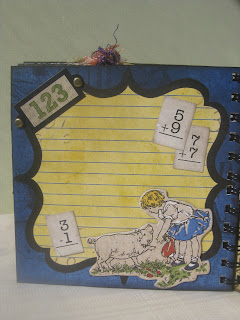
I left this page very simple.  The paper background is just a section of the 12 x12.  The addition tiles and the little girl image are both chipboard stickers and the little '123' sticker is also part of the collection, as are the brads.

This is another relatively simple page just made to look complex.  I used my Crop-a-dile to punch 4 holes and set 4 brass-colored eyelets, then I strung twine through the four to create a 'belt' of sorts.  I then used Bo Bunny stickers and chipboard pieces to decorate the page and the two tags I handcut.  I've only removed half of the adhesive paper backing on the chipboard swirls so that the tag will sit behind them without getting stuck.

 
 These are two tags I hand cut out.  One uses the ruler stamp from the Hero Arts Just a Note stamp set, the other I ran through my Big Shot using the Cuttlebug numbers embossing folder the Tim Holtz Collage die would be perfect.  
I gently ran a foam blending tool over the top to make the embossed image stand out more.

SUCH an easy page to recreate--everything here is from the Learning Curve Collection.  The math sum and date due card are both from the chipboard sticker set, as is the little crossword in the corner (I cut it up and wrote words in the grid to give it extra interest).  The apple punch on the background is from the Learning Curve Stamp set.  I tried to recreate an old-style worksheet look by adding the dashed line and scissors image on the edge of the page. (Oops!! The scissors are from Hero Arts Just a Note stamp set--I lied, just that one thing wasn't from the Learning Curve Series!!)

This was a VERY easy page to make. I used three chipboard stickers from the Learning Curve Chipboard and created my own Bus Pass using Hero Arts Graph Background Stamp, Peeled Paint and Black Soot Distress Inks, Hero Arts Printer's Type Alphabet Stamps and Papertrey Ink "School Time" and "It's Official" sets.


 To make it look as though this Bus Pass had been thrown into backpacks and stuffed in pockets, I folded it several times, spritzed it with water to soften it, distressed the edges and smudged ink over it.  I also ripped small sections and used a stapler or sticky tape to put it back together again (as I think a child would have!)

The other side of the Bus Pass-perfect for journalling.  This is one of the cut outs from the Learning Curve set.  As you can see, I made it look REALLY abused with folding, ink and sticky-tape (cellotape).

 
This back page is SO simple but I think it's probably one of my favourites.  This paper collection is really vintagey, so I thought it would be cute to make it look as though the books were being held together by a belt or string, as was common "back in the day" :) 
The tag was hand cut, with the "This Book Belongs to" from the Learning Curve Stamp Set.  I used an old Dymo labler to make the name sticker.


Well that's it!! I hope you liked it. I had so much fun working on this album.  It's amazing how easily everything comes together when you have coordinating papers and embellishments to work with!!

As always, please feel free to leave comments-I'd love to hear what you think!

I'll be back on Wednesday with a special Guest Blogger-Virginia Lu!! I'm so excited to have her here on the blog with some truly GORGEOUS cards to show you :)

Talk to you soon lovelies!! 

Linda

Thursday, 16 September 2010

You're so special--card

Hello again!!

I thought we could take a break from all the fabulous new Halloween and Fall products I've been showing you--not that they're not fantastic--and show you a card.

This card caused me some trouble.  Well, the background did anyway.  I've had the backing piece for several months now, maybe even 2 or 3 and I just never got the right inspiration to finish it off. Nothing felt quite right--I have one or two of these lying around on my craft table.  I hide them away in a little basket I have and bring them out every so often to see if staring at them for a few moments will spark some creative inclinations in me, or if they'll just still be unfinished.  We all have those moments I'm sure.


I made the background section (the green with the white embossed fern print) on it when I had only just started my cardmaking.  It was a fairly simple series of techniques to get to the finished piece, but to incorporate it into a card?! Well, as I said, it caused me trouble.

I'm not going to go into detail on the "how to's" as I think most of it is pretty self explanatory but here is a quick point form of what I did--as always, feel free to email me/leave a comment if you have any questions.

The backing card
Here are the products I used;
Hero Arts Fern Silhouette woodblock stamp, Hero Arts Friends Definition cling stamp
Tim Holtz Distress inks in Walnut Stain , Forest Moss, Peeled Paint (just a little)
White embossing powder
Versamark ink

How I did it:
* I stamped the Friends Definition cling stamp onto cardstock and waited for it to dry.
* I distress inked the background in mostly greens, with a bit of brown around the edges.
* I distressed the edge of the card and added Walnut Stain ink
* Using Versamark, the Fern Silhouette woodblock stamp and White embossing powder, I created the fern image (note how I sat the fern in different positions on the cardstock so you could see various areas of it.  I didn't want the repeated image to be identical but merely uniform--or complimentary)

The Front section/embellishments
The central label;
I hand-cut the label after tracing around one from a tag on something I got in the mail the other day but it's a spellbinders Labels #9.
Distress ink in Antique Linen, Wild Honey, Black soot
Hero Arts Graph background woodblock stamp (it's very pale but shows up more in real life)
Hero Arts Great Flourishes Messages Clear Stamp set(sentiment)
Memento tuxedo black ink
Perfect Pearls in Kiwi
Glossy Accents (around edge of the label for extra shine)

extra items--gold ribbon, , 4" paper doily, black cardstock, Prima say it with pearls flourish (discontinued)--you could easily replicate this with Kaisercraft bling.

This label section was very easy, just lots of simple little steps to create a lovely finish.
*First I cut out the label and inked the whole label with Antique Linen
*Next I stamped the Graph background with Antique Linen (this gives a really nice finishing touch and added interest)
*I stamped the sentiment in Memento Tuxedo Black ink
*I inked the label with distress inks (Wild Honey--I'm so in love with this color)
*With Black Soot distress ink I edged the label
*I dusted perfect pearls over the entire label
*I added a fine line of Glossy Accents around the entire edge of the label and tied the ribbon around it.
*Using Antique Linen & Wild Honey distress inks, I coloured the doily.

Then I just adhered everything to the backing card (the label is on dimensional tape) and added some bling, which I cut apart to my liking!


I love how elegant it turned out.


Here's a close up look so you can see the shimmer of the perfect pearls--gorgeous right?!

Hope you like it!!  Please feel free to comment or contact me if you have any questions!

~~~thanks so much for looking!!

Linda
x

Monday, 13 September 2010

a quick note...

Hi everyone,

Sorry it's been almost a week since I posted last, it's been super busy here. The a2z blog has been taking up a lot of my time but I'm finally finished all the set up and I'm starting to work ahead of time.

I've been playing with a new crafty project that I'll share with you really soon. It involves a little wooden jewellery box I found at our local $2 shop and some Distress Crackle Paint, as well as some Perfect Pearls and of course, stamps :)

Anyway, this is just a quick little note to say hello to you all and let you know I'm still here and DEFINITELY coming back!!

Speak to you soon--thanks for your patience :)

Saturday, 11 September 2010

Patriot Day

Hello again Sweet Friends,

I'm sure you're all aware of the date.  There's no need for introduction or explanation, but I feel it was too important to not be mentioned and wanted to make something in recognition of this important day. Patriot Day.

I wanted to make something to mark the date.  After some thought, I decided to do a tag for Patriot Day instead of a card, but it turned out to be a book mark. I think it would make a nice school project actually, or even a present for teachers or children or a lovely Veteran's Day gift. I liked the idea of keeping the flag image (as well as the sentiment) close to you at all times. Most people have something like a book or diary with them all the time, so this is what evolved.  

On the front, I wanted to recreate the Stars and Stripes, but with a more homemade feel.  I was playing with the image of a house to go with the sentiment that I used, but none of the houses looked right.  I didn't want to implant an image of a house in anyone's mind, because homes can be so different.  I thought it best to have just the sentiment and the 'flag'.  It makes the sentiment much more meaningful, because it immediately makes one think of their own home, so it's that much more personal.  


On the back I've printed the national anthem (which I found on THIS site) 
I changed the font for the final words "The home of the brave" to 'bold' because personally, (especially as a "non-American"), that is the line that I always remember and that I find the most powerful. 


Here is a list of products used:
Spellbinders Labels 4 Nestabilities Dies
Hero Arts Canvas Stripes Stamp
Hero Arts Dots and Flowers Stamp
Stampendous Red Transparent Tinsel Embossing Powder and Stampendous Stamp N Stuff Embossing Powder Clear Transparent
Distress Ink Tumbled Glass, Distress Ink Stormy Sky, Antique Linen and Tim Holtz Distress ink Walnut Stain
Versamark ink
Spellbinders Standard Tag Cut and Emboss Dies
Making Memories Eyelet 1/8"
Wrights Bell Tassel 1-1/4",
Tools used: We R Memory Keepers Crop-A-Dile Eyelet and Snap Punch   and a home printer for the sentiment on front and the National Anthem on the back.


--ooOOOoo--
 

 In closing, I would like to say the following:

In loving memory of those who were lost.

In humbled gratitude to those who serve to protect that of which we hold dear.

 We wish for a safe and peaceful Patriot Day--may all the days that are to come, be full of harmony, quiet and calm.


Thank you all for stopping by--have a safe day with your families and friends.

Linda