Thursday, 27 May 2010

Kristina's colour inspiration photo challenge #2


Hello!!!

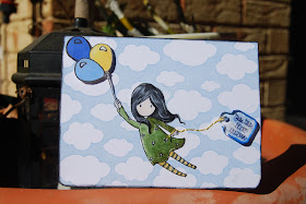
It's been SUCH a quick but busy week this week I've had barely any time to even think of posting. I've made a few cards but the first one I want to show you is my GOOORGEOUS *if I say so myself* entry for Round 2 of Kristina's colour inspiration challenge. Not all of these precise colours where in my stash so I've gone as close as I could.


This card actually makes me smile...*happy dance*

Here she is...(yes she's a she)...

I hope you love her as much as I do, I love how innocent and almost helpless but in a calm way that the little girl looks...like "oh, i've just been swept away...oh well"...the moment I saw her on a card last month I HAD to have her :) and now she's mine.

I wanted the sentiment to look like it was trailing along behind her but nothing made sense (why would she be carrying 3 balloons and a banner or a frame?!) then I saw my stash of TH fragments and this one looked like a little bag to me--and what girl is complete without a handbag?? So I stitched some pretty golden yellow thread and tied it around her hand so it looked like her mumma had tied it to her so it wouldn't get lost--I remember my mum used to do that with balloons to me when I was little.

Thanks to suzanejdean& Lisa Spangler from Hero Arts on for their youtube "Colouring hair with copics" tutorials--fantastic! tThey're life savers--the strawberry flavoured ones :)


Thanks for looking!!! Another short entry will follow soon with a couple of new cards I have to show you:)

Linda xx

Materials used:
White cardstock
Sky : Versa color #38 Sky Blue Hero Arts
Clouds designblock stamp (FAVOURITE!!!)

Girl: Sugarnellie (Gorguss Girl) "Up Up and Away"
Yellow & pale blue balloon & girl's dress: Copic Markers (I'm still new to these but I'm pretty happy with how it turned out...I'm no
Lisa Spangler but hey...
Dark Blue Balloon: StazOn Hydrangea Blue

Highlights on girl's dress & hair: white uniball signo pen.

Handbag/sentiment string: DMC Embroidery Floss
Tim Holtz Fragment, Archival Ink Jet Black for stamping outline & sentiment.
Sentiment: Hero Arts All Occasions Messages.

Saturday, 22 May 2010

update and a few cards...

Hello!

Here are a few cards that I made over the last month. Some are finished, others I think need a little tweaking, most are just the result of some playing in the late hours of evening.


hope you liked--thanks so much for looking!!

L xx

Wednesday, 19 May 2010

Colour inspiration challenge Card #2 Thinking of you


Goodevening!! (or almost goodmorning as it's nearly midnight).

SO! a quick post this time. I've got another entry for Kristina's
colour inspiration challenge. I'm really happy with this little card, although the photos aren't the worlds greatest. I'm living with my parents at the moment (talk about crowded!) and this house is REALLY dark.
Perth is a pretty hot city so big verandas all around/eaves providing shade are a must but they're a pain for photography indoors!! (and it's nearly midnight as I mentioned, so outdoors wont give me much better light! lol)

anyway, here's my little baby ...


{i hate that you can't see the colours AT ALL in this picture. I might update in the morning when I have more light...}

{inside}


I'm only going to give you the products used list this time and say I used a layered resist technique (see Jennifer McGuire for tips and techniques);

LOTS of distress ink; pumice stone, bundled sage and broken china for the inking of the main section; tea dye for the friend definition behind the inking (doesn't show up in photos) frayed burlap & walnut stain (for edging),
AC cardstock in pastels.
Boutique Ribbon in pale blue
Corner Chomper Deco
Clear embossing powder.
Hero arts Friends definition cling stamp
Hero Arts French letter woodblock stamp (on butterflies)
Martha Steward Butterfly punch
Hero Arts Clear Design "Thinking of You" sentiment (inside card)and flowers image.


If you have any questions or comments, please feel free to drop me a line!

Hope you enjoyed!!! TFL!!!

Linda xx

Tuesday, 18 May 2010

Kristina's colour inspiration photo challenge

Hi all!

This past week, Kristina from http://www.kwernerdesign.com/blog/
held a colour inspiration challenge in which her readers entered photos as inspiration and we all voted for our favourite. The winner is above with the ribbon and flower.

Below is my take on it--the first anyway, I love this colour combination and I have a few more ideas.

I just got a package in the mail that included the GORGEOOUUUUS M.S umbrella punch...I couldnt wait to play with it, so out it came for this challenge! It's my first colour challenge but I love the concept and think I'll try to participate in as many as I can.


First I made the green and white-grey umbrellas using Distress Crackle Paint in Milled Lavender and Peeled Paint on manila cardstock and punched them out. Next I punched out two dark pink and three lighter pink umbrellas from AC Pastel A5 collection. I used the slash symbol from a Kaisercraft set of alphabet/number stamps as the rain and Versamark inked it up, placing it randomly (but on the exact same angle) all over my acetate card. I then embossed it with white embossing powder and heat set. I think it would be nice to make the rain out of little hearts too as an alternative-'you shower me with love' would be a nice matching sentiment maybe...

Next I punched a circle hole in grey cardstock and attached to the back of the acetate and sewed around the edge. I placed the dark pink umbrella over the hole and put it on dimensional tape and dots to raise it, giving the card more dimension and bringing even more focus to this particular umbrella. I was going to use a chipboard flourise to signify the wind that blew the dark pink umbrella away from the group but it didn't sit right so I left it. I think it's clear that the umbrella is blowing in the wind anyway.

Finally I stamped the sentiment with archival black ink.

On the inside of the card is pretty simple, it's a blue piece of cardstock that you can see showing through to the front, with some white cardstock attached. Another punched dark pink umbrella is lying on the 'ground' in the far right corner as though it's been left to dry out (after the storm) and isn't needed any more. I've hand-written the sentiment "for being my umbrella in the storm"...you could also write something like 'for keeping me out of the rain' or something else along similar lines.

I really loved this idea in my head but when I finished it I just couldn't decide if I loved it or hated it. In the clear light of morning, I like it again :)

I do all my crafting/card-making in the late evening and the room I'm in has horrible light, is cramped and entirely UN-inspiring so I get a bit lacklustre when I see what I've made in the semi-darkness! Morning light always makes things much clearer.

Hope you enjoyed! TFL :)

Linda

Monday, 17 May 2010

3 cards for you today!!! No wonder it took a week for a new post...


Hello!!

I'm typing this with Isabella sitting on my lap singing "Row Row Row your boat" (but her special version)...

I've made three cards this week, with much frustration on one but the other two came easily and with little thought (always the way for me!)

The first, "Thinking of You" above is a card I tried to incorporate lots of techniques into.
FIrst I chose a piece of green bazzil cardstock from my new pack of pre-cut pieces. HANDY!! I then stamped the gorgeous leaves woodblock stamp from Hero Arts in Forest Moss Distress ink.
I then stamped the same image in a light brown distress ink (I forget which one!!) and rubbed some perfect pearls gently over the top. Next I cut out some flowers using my NEW EK Success flower punch and then stamped & embossed them wit a Hero Arts swirl woodblock stamp. I simply layered them with their petals on angles with each other and secured with a button & some thread. I also inked the edges just lightly with distress ink.

I then hand-sewed some green thread to make the stem. It's only very light and not too easy to see in this picture but I kind of like the subtelty of it...(subtelty doesn't look right spelt that way...hmmm)

I stamped the first two words of the sentiment with plain ol' black stayz-on, onto the card stock, then I chose the smallest Tim Holtz fragment charm I could see and stamped the 'you' onto it with the same stayz-on. I also dipped the back of the charm in versamark ink and embossed it with the same swirl stamp I used for the flowers, but used the 'kissing' method Jennifer McGuire uses (where you cover the surface in embossing powder, ink the stamp and then kiss the stamp to the already embossed surface.)

Again, a subtle effect but I like it.
Then I tried desperately to stitch neatly around the edges with my sewing machine (to no avail!) but I like the look. Handmade items are supposed to be a tad less than perfect I think and the wonky stitching certainly makes it look handmade! (I'll keep telling myself that!)


This next card is called "for the graduate" and I love it!
I distress inked a piece of dictionary paper in mustard seed and forest moss in the centre of the page with tea dye and walnut stain on the edges for a nice aged look. I also screwed the paper up tightly a couple of times then swiped the crevaces with dark walnut stain in a sweeping motion. Next I tore up the edges to make it look as if the page were almost burnt. I added extra walnut stain DI where needed.
I took this gorgeous little chipboard owl and just added crackle paint in peeled paint and left him to dry--what a hoot! (*wink*).
Next I tore a piece of plain ol' notepaper out of a tiny notepad I have, stamped the sentiment from Tim Holtz' stampers anonymous series and distress inked the page with the same colours as above (walnut stain mostly, a touch of tea dye and a swipe of the forest moss to tie in the colours). I crumped the paper up just lightly to reflect the dictionary paper.
Then I just compiled them all on top of each other, only lightly adhering the notepaper to the backing so that it stood up off the card a little (I didn't want to use dimensional tape/dots as I didn't want lumps. I wanted it to sit naturally so I just dotted glue-tape and put tiny amounts of double-sided tape all over the back of it). To finish, I used my gorgeous Dymo label maker to add the 'the graduate' sentiment and the 'congrats'.


This next one only took a few minutes to actually make really. I did as little thinking as possible (which always tends to work better for me) and lots of playing. I stamped the Hero Arts leaves woodblock stamp in forest moss onto green bazzil cardstock and swiped some Forest Moss DI on the edges, with a light covering of Broken China, Milled Lavender and Bundled sage DI. I used these same colours on the tag and but first I stamped the same leaves image in versamark and used white embossing powder to cover it. Unfortunately this was a new tub of embossing powder and it had caked up a bit in the store so it didn't give the usual smooth coverage, but it ended up looking quite nice in reality despite the grainy texture--added for some interest. I punched 8 pieces of scrap paper out and temporarily adhered them to the tage before distress inking them, to create a shadow effect (or the opposite of a shadow really), then after DI'ing the tage, I punched out the same number of squares from vintage textbook paper and attatched those to the tag just off centre to the blank 'shadows' below, using dimensional tape to give some extra height & dimension. The text page squares were edged with a little Broken China DI and a TINY bit of Walnut Stain.

done!!

ok, both kids are now clambering for attention, so that's mummy's time at the computer done...more soon :)

Thanks for looking, hope you enjoyed!! Feel free to comment :)

Monday, 10 May 2010

playing with new distress inks...Miss You Card...

{The colours look really washed out here but you can see the gorgeous rusty effect on the hearts }

Hi there! I forced myself into the craft room tonight, despite having had a rotten day preceded by a worse day yesterday (happy mother's day to me--boo!). I had absolutely NO creative inclinations tonight but I just had a new lot of distress inks arrive and I thought I'd play.

First I went over a little piece of note paper in Faded Jeans--what a great colour! THen I scrunched the paper up to get some texture, pressed it out flat (flat-ish) and ran the Ranger Distress Inking Tool gently over the top to ink the crevaces created by my scrunching. This gave an awesome denim effect. I fiddled around to find papers that matched and settled on some core-dinations cardstock and some unusual patterned paper I picked up at my local store on sale, many months ago.

It took me a while to get the layout just how I wanted it, but I managed in the end. Eventually I got there, but it felt like something was missing, so I added three little punched hearts that I'd inked up last week in preparation for my mum's mother's day present but never used. I added those on some dimensional tape for some extra interest and I love the result! Hope you do too.
The colours are pretty much the exact opposite to my usual bright and airy style but it's always good to try to push yourself out of the box hey?!

I think these colours would work well as a masculine card, sympathy card or just a hello card too.

Hope you enjoyed! Thanks for looking :)

Thursday, 6 May 2010

Provincial butterfly cottage


So this is the gift I made my mum for Mother's day. I utilised the techniques Jennifer McGuire 'taught' me via her Thinking Inking videos on youtube (for Two Peas in a Bucket)...I found her vids SOO inspiring, I crafted every night till midnight before dragging my heavy eye-lidded self back to bed to feed Charlotte a bottle.

I suddenly had the idea for this Abandoned French Provincial cottage for my mum and it really didn't take very long for me to achieve the look I was after. I painted the whole cottage with white 'student' paint (twice) and then with Crackle Paint in varying thicknesses over the walls, giving the house a really old, abandoned/provincial feel to it. I hated Crackle Paint the last time I used it (about 2 years ago) ...but my gosh I'm in LURVE now...can't wait for tomorrow when I can head to my local scrapbooking shop and buy some more!!! I left the roof and 'floor' around the cottage white to achieve a snowy effect.

If I'd tried to make this even 2 months ago, I would've over-thought it and really messed it up with my need for neatness, clean lines and matching matching matching...I'm letting go!!! As Julie Fei-Fan Balzer said, I'm going to revel in the imperfections...and I'm so excited that this project worked so well...I might have to make one of my own!

I really love the end result and mum did too!! (Yes I gave it to her early :))...now, if only I could actually find a real-life version of this then I'll be happy!!

Hope you enjoyed!!

Lx


Materials Used: White Acrylic "student" Paint (all over cottage), Tim Holtz Crackle Paint in Frayed Burlap, various Tim Holtz distress inks, Perfect Pearls, Wooden House 'puzzle'/model (from "The Reject Shop"!!), manilla folders cut into butterfly shapes using Cuttlebug die & Martha Stewart craft punch.

Kristina's colour inspiration photo challenge


Here are the two photos I thought would submit for Kristina's colour inspiration challenge. The photo of the landscape is from Margaret River, a small town at the very south of Western Australia, famous for it's beach and wines. We went there on a short holiday a few months ago and stayed on a tiny hobby farm. The quiet was SO lovely, no noise but the breeze and crickets chirping. This photo is a view from the front door of the little house we stayed in. The colours are, I think, really unique to Australian sunsets, I've never seen any colour combinations like this anywhere else...its one of the few things I really miss when I'm in another country.

THe other photo is from the Sumo tournament we went to in November of 2009 when we went back to Japan on holiday. It's a traditional 'roof' that hovers over the Sumo Ring and is in typical traditional Japanese colours. I adore the deep lush purple that symbolises Japan's royalty and the combination of crisp white with bright green & red are truly unique to japan. I think theyd make a gorgeous card.

anyhow, hope you like and they inspire you to create something that takes you to your happy place :)

Linda

Monday, 3 May 2010

putting Jennifer McGuire's tips to the test...


Kristina from www.kwernerdesign.com set a weekly challenge to create a gender neutral card; this is my entry. I'm not usally a fan of orange or brown AT ALL...but I'm trying to force myself out of my creative safe-zone...these challenges are a great way to do that..

So I've completed several cards just playing around since startin g this blog but I nevet got time to put actual entries up, so I'll try to arrange a slide show. Then I'm going to add an entry about my Wedding Guest album that I did for my girlfriends wedding...if youtube will play nice anyway...PHEW!! (Hope my kids realise that I'm trying to do something important here!! Give mumma a minute!!!)